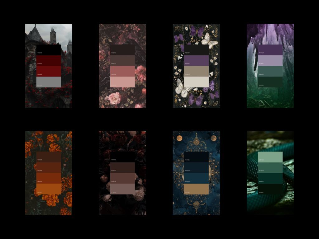
part 1
When you think of a gothic wedding, there’s a fairly good chance your mind immediately goes to black and red. Black bridesmaid dresses. Red roses. Burgundy tablecloths. Maybe a few skulls thrown in for good measure. And don’t get me wrong, there is absolutely nothing wrong with black and red if those are the colours you genuinely love, but gothic weddings can be so much more than repeating the same colour palette we’ve seen hundreds of times before.
One of the things I love most about alternative weddings is seeing couples create an entire world around themselves for the day, whether that world feels dark and romantic, wild and overgrown, celestial and otherworldly or like something pulled straight from the pages of an old gothic novel.
Colour can play a huge part in creating that atmosphere.
I’ve spoken before over on the Dark Wedding Collective about choosing a wedding colour palette that doesn’t feel like Pinterest vomit, particularly why I think you should start with how you want your wedding to feel rather than immediately looking at whatever colours happen to be trending that year.
But this time, I wanted to go a little deeper into the inspiration itself.
Because if you know that you want a gothic wedding but haven’t got a bloody clue where to begin with the colours, here are some ideas that go far beyond simply throwing black and red at everything.
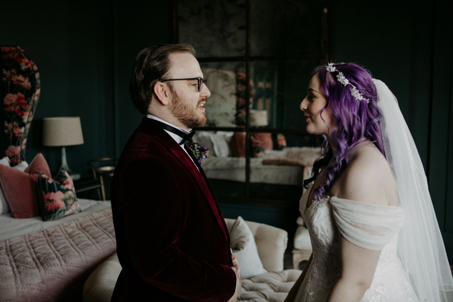
The Jewelled Romance
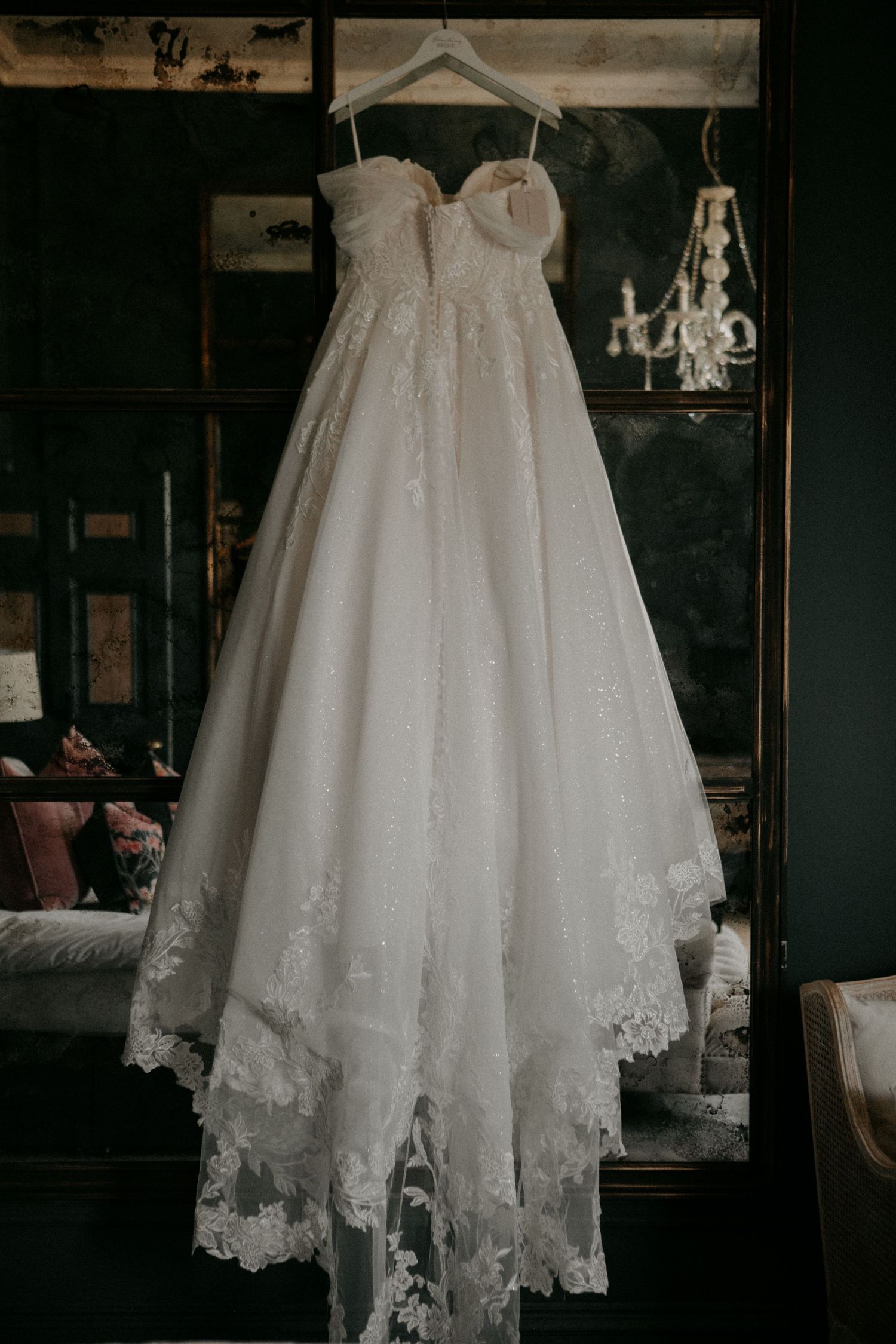
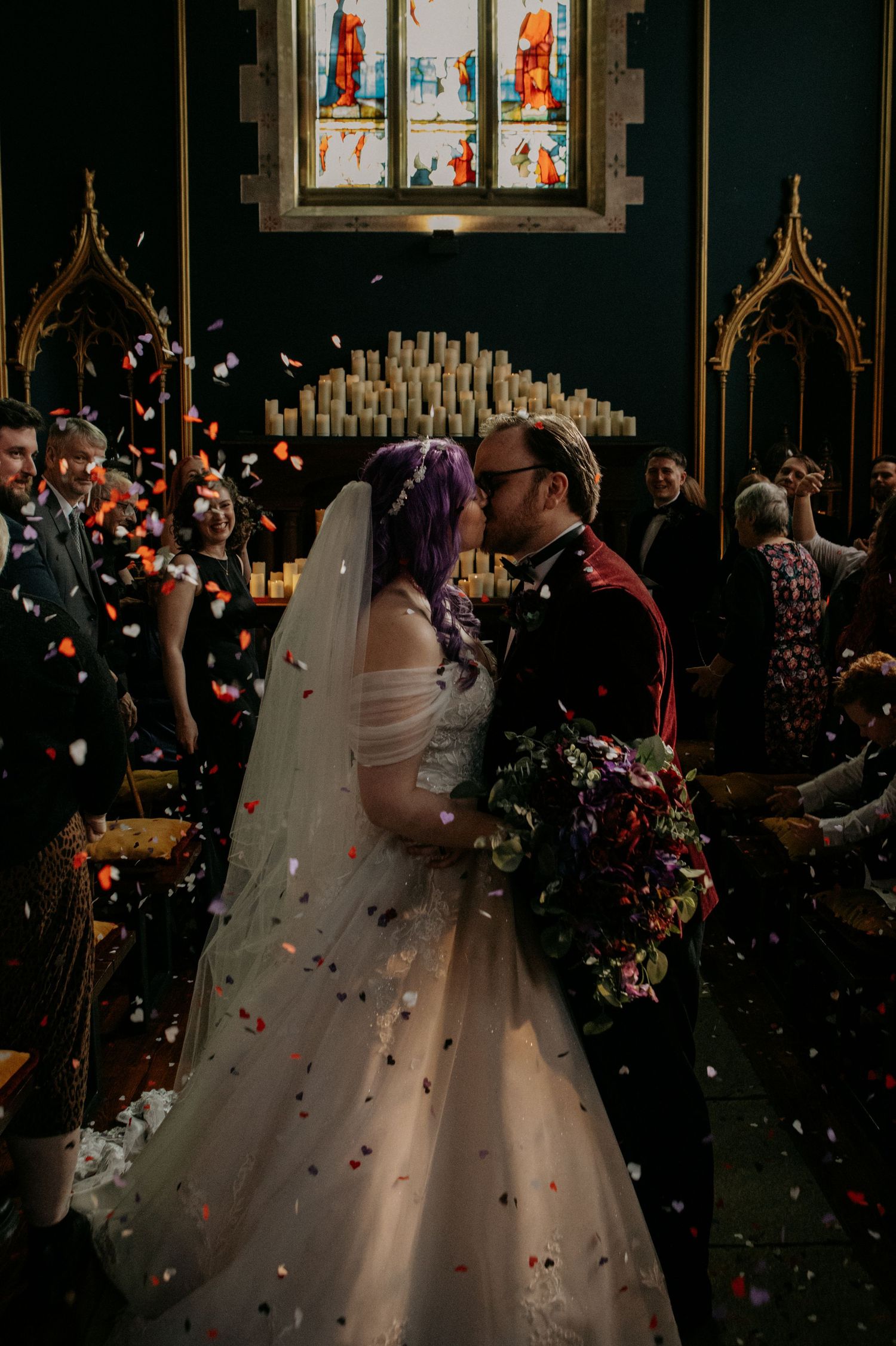
If your idea of romance involves candlelight, old buildings, dramatic florals and the feeling that you might be attending an incredibly elaborate dinner party in a haunted manor house, rich jewel tones could be the perfect place to start.
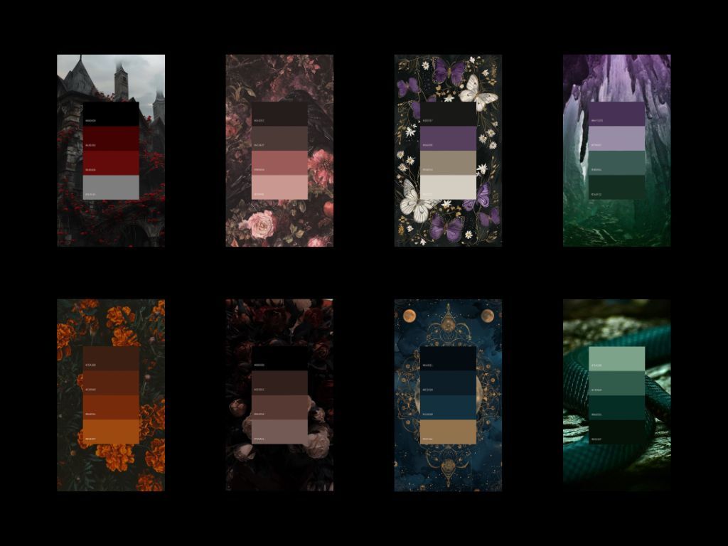
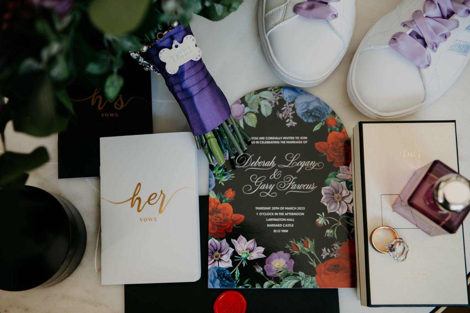
Think deep emerald green, sapphire blue, amethyst purple, ruby red and dark garnet, using those intensely saturated colours alongside touches of black and antique gold to create something that feels wonderfully opulent and dramatic. What I particularly love about jewel tones is the amount of depth they can bring to a wedding without relying entirely on black to create a darker atmosphere.
Rather than choosing one main colour and trying to match everything perfectly around it, you can layer several different jewel tones together, allowing deep greens to sit alongside rich purples, blues and reds. Bringing in textures like velvet, silk and dark foliage alongside aged metals and plenty of candlelight can make those colours feel even richer, creating a space that feels warm, atmospheric and slightly decadent rather than simply dark.
From a photography perspective, jewel tones can look absolutely incredible in historic venues, old manor houses and spaces filled with dark wood, stone walls or dramatic architecture because the colours work with the atmosphere that already exists rather than fighting against it. When the light catches those deeper colours, particularly against velvet, glassware and metallic details, they can bring an incredible richness to both the space and the photographs.
It’s gothic romance at its most indulgent, filled with colour, texture and drama while still feeling dark, atmospheric and beautifully timeless.
Bright But Offbeat
Gothic and alternative weddings don’t have to be dark. There, I said it.
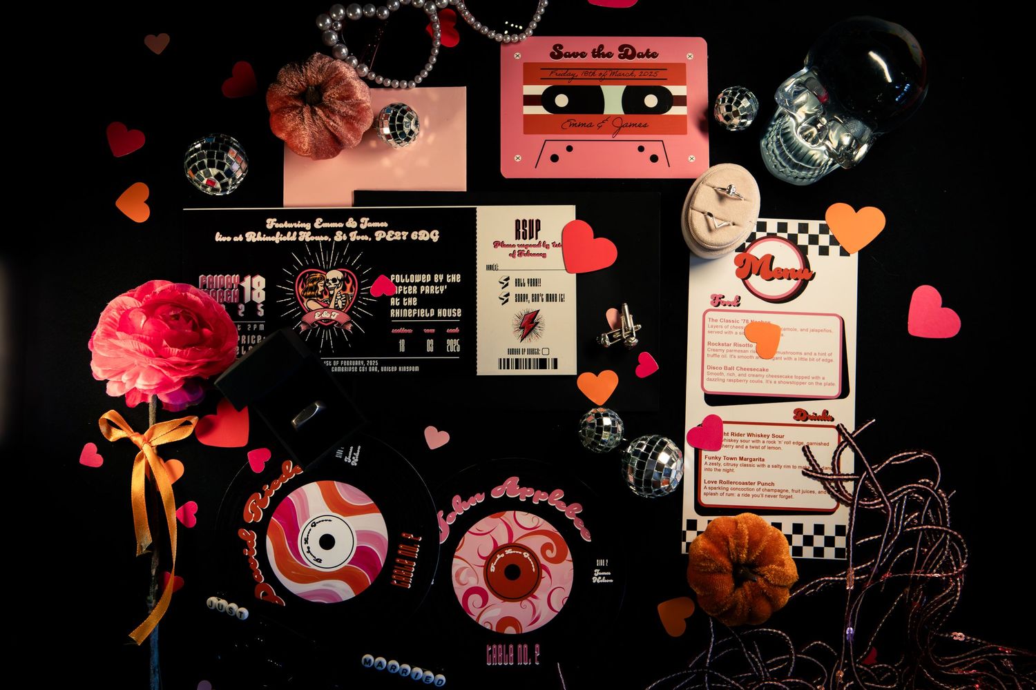
You can love alternative fashion, unusual venues and doing things completely differently while also wanting your wedding to be absolutely bursting with colour, and combinations of bright pink and orange are perfect for creating something bold, playful and impossible to ignore.
Think hot pink, fuchsia, magenta and coral mixed with vivid tangerine, burnt orange and warmer peach tones, layering different shades together rather than choosing two exact colours and attempting to perfectly match everything to them. These colours naturally have a huge amount of energy, but mixing brighter shades with slightly deeper and warmer tones can give the palette more depth and stop it from feeling too polished or predictable.
I imagine overflowing colourful florals, bright taper candles, mismatched glassware, bold stationery and maximalist tablescapes filled with strange little details that your guests discover throughout the day. You could bring in clashing patterns, unusual textures and unexpected decorative elements, creating the kind of wedding where there is always something new to notice no matter how many times you look around the room.
What I particularly love about bright pink and orange is that they can feel wonderfully rebellious when used within an alternative wedding. There’s something incredibly fun about taking colours that might traditionally be associated with bright summer celebrations and combining them with unusual venues, alternative fashion, tattoos, dramatic styling and all of the wonderfully weird things that actually feel like you.
This kind of palette is perfect for couples who want their wedding to feel energetic, theatrical and completely unapologetic, proving that alternative doesn’t automatically have to mean dark. Your wedding can be weird, colourful, unconventional and completely fucking fabulous without a single black rose in sight.
Strange And Unusual
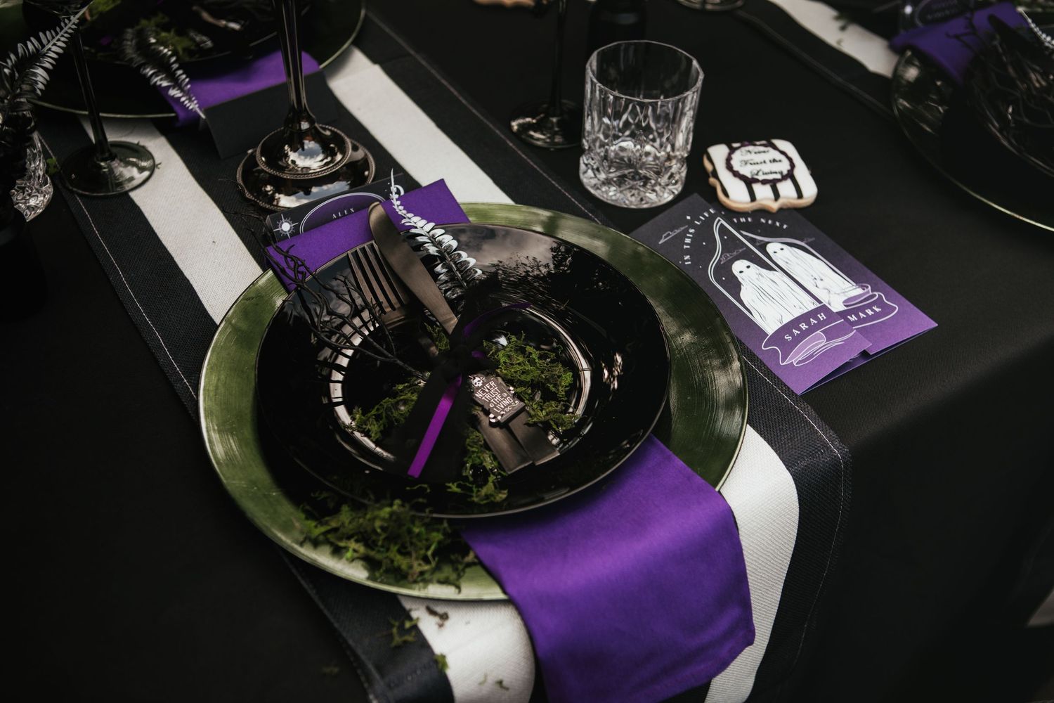
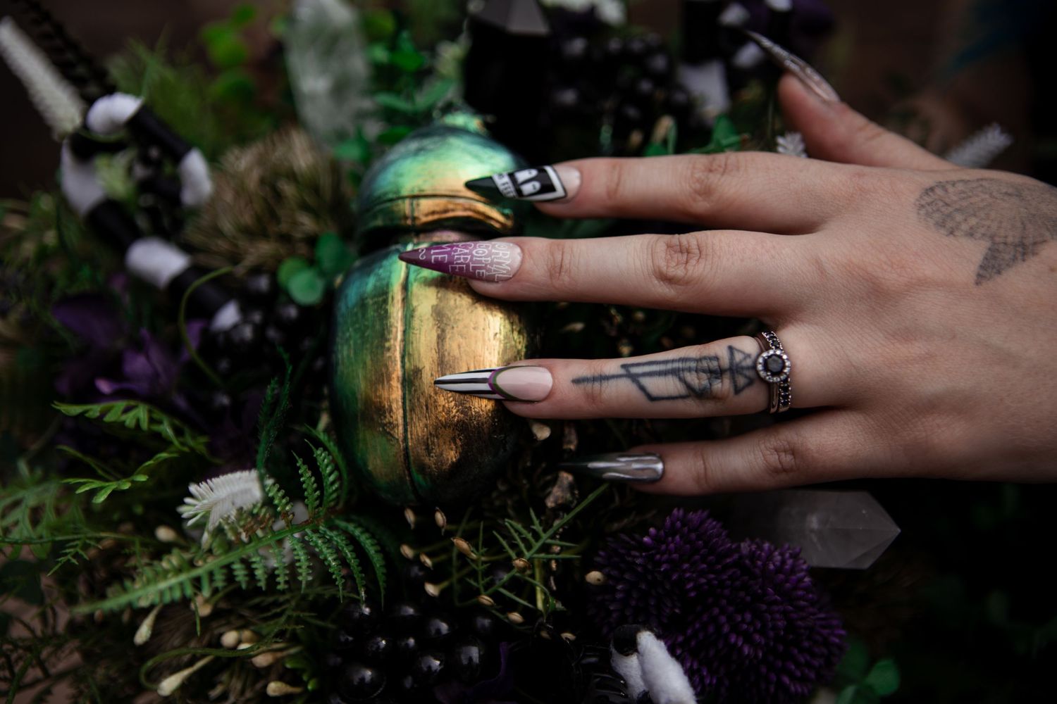
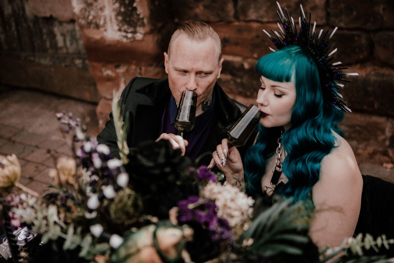
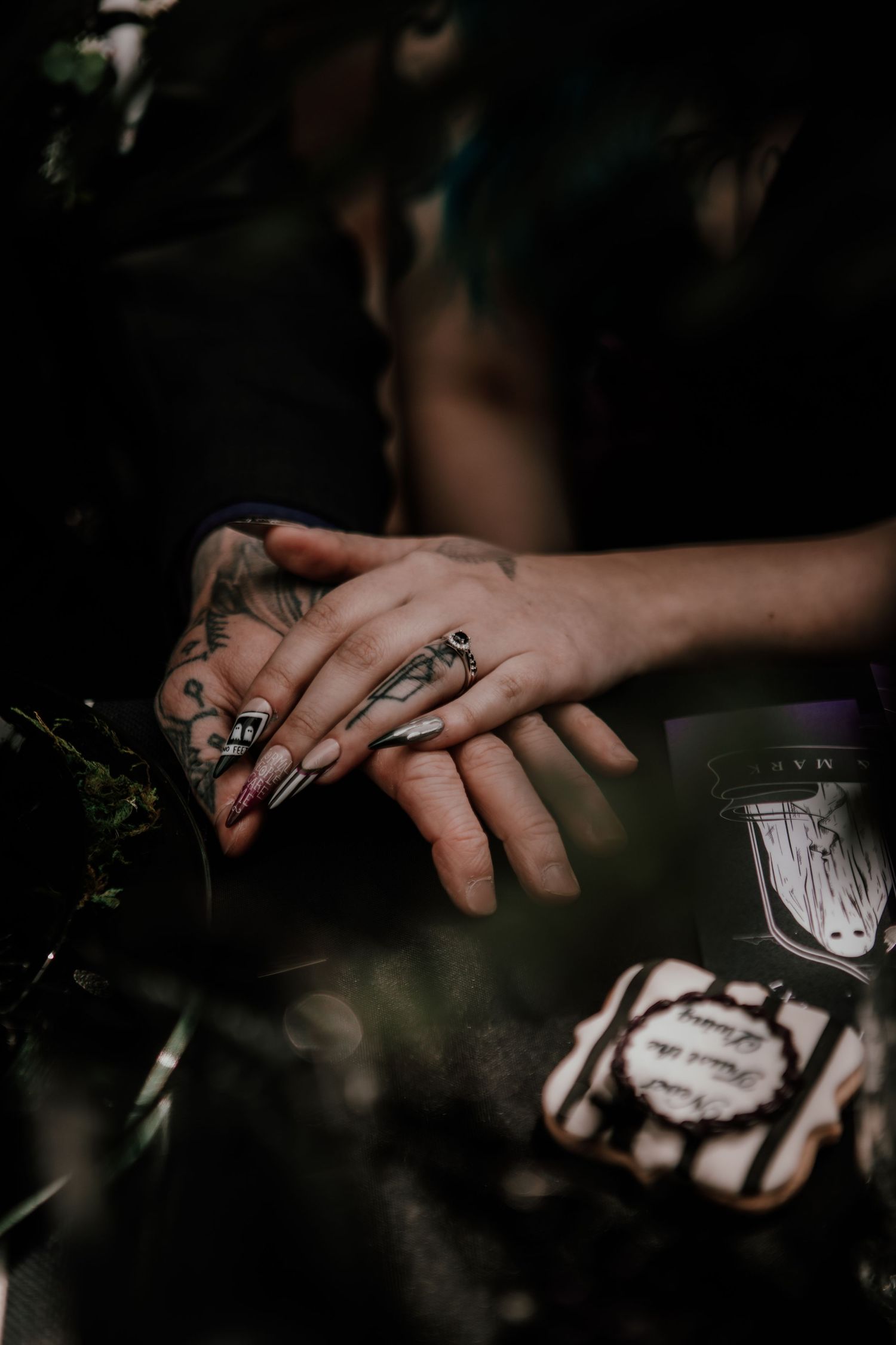
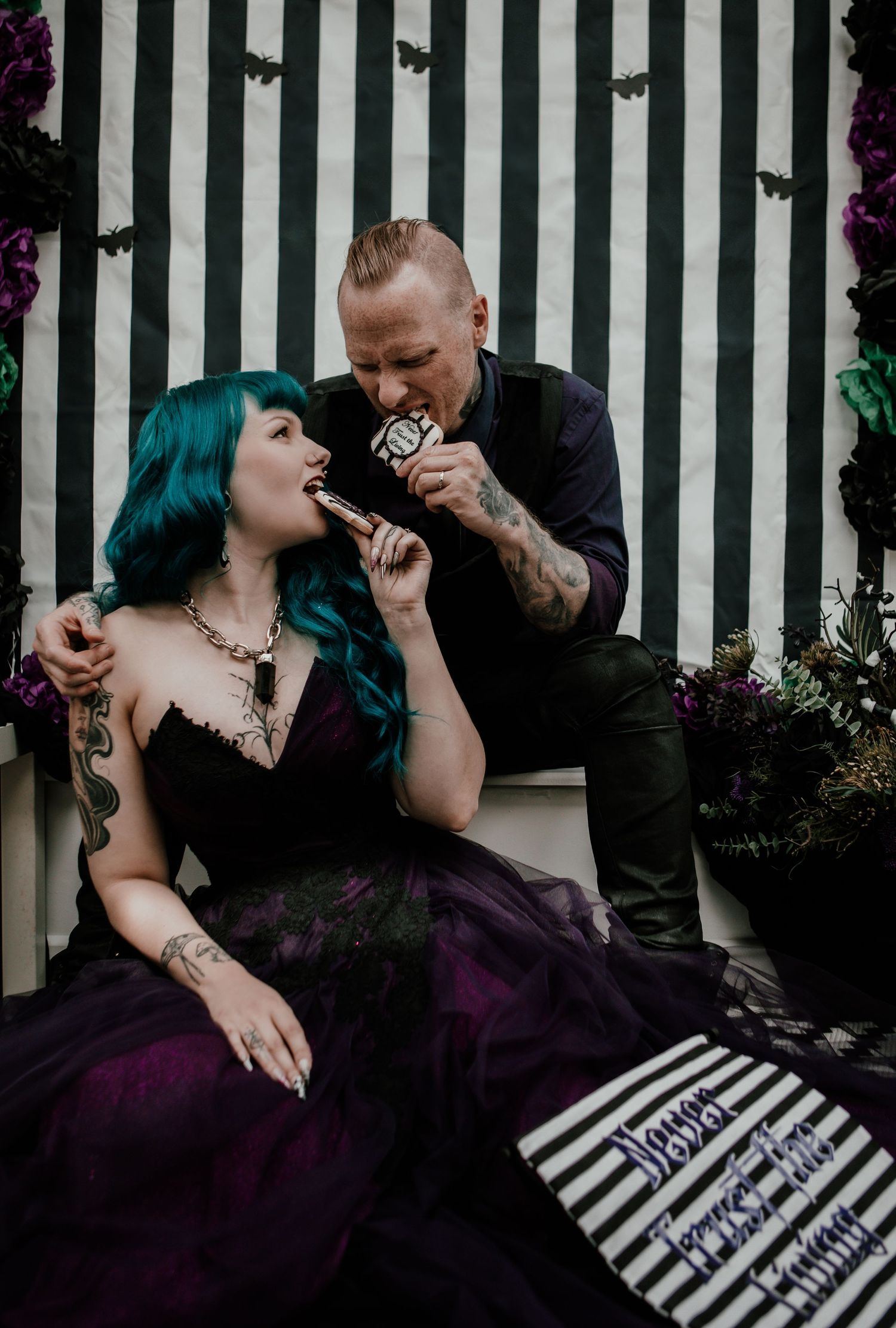
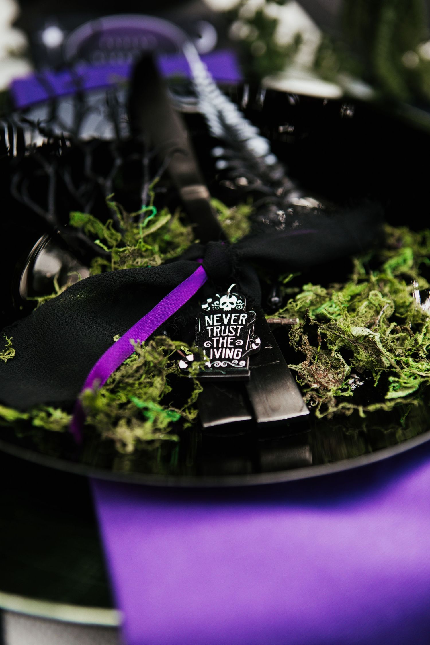
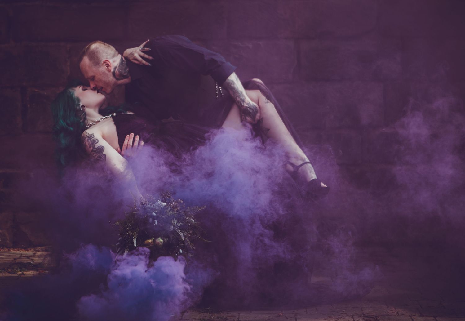
If your idea of the perfect wedding involves something a little weird, theatrical and completely unexpected, taking inspiration from the wonderfully chaotic world of Beetlejuice can create an incredible colour palette without your wedding needing to become a full-blown themed event.
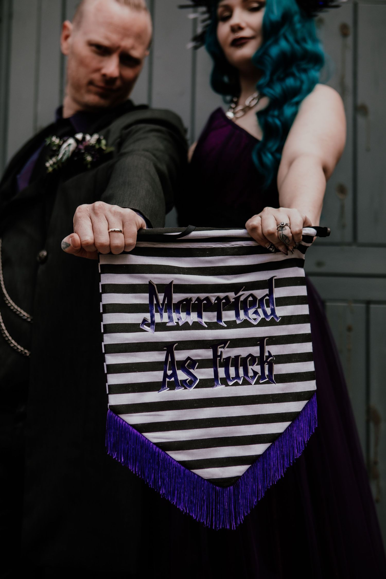
Think vibrant purples and acid greens mixed with bold black and white stripes, using the monochrome elements to create a strong foundation before bringing in those brighter colours through florals, stationery, candles and all of the strange little details scattered throughout the day. Rather than trying to perfectly match one specific shade of purple or green, layering everything from deep aubergine and rich violet to vivid lime and darker mossy tones can give the palette much more depth while still keeping that wonderfully chaotic feeling.
What I love about this combination is that it really shouldn’t work as well as it does, but somehow the contrast between the bold black and white stripes and those almost unnaturally bright colours creates something that feels playful, dramatic and unmistakably alternative. You can go as subtle or completely ridiculous with it as you like, whether that means incorporating a few striped details alongside colourful florals or fully embracing maximalism with unusual props, dramatic tablescapes and décor that makes your guests wonder what the fuck they’ve just walked into.
This is also the perfect example of how taking inspiration from a film doesn’t mean you need to recreate it literally. You don’t need actors dressed as characters or every single detail covered in references for people to understand the world you’re trying to create. Instead, you can take the colours, shapes and wonderfully strange atmosphere that initially drew you towards it and turn them into something that still feels completely your own.
Because sometimes the best wedding inspiration comes from throwing out everything that is traditionally supposed to work together and embracing something a little strange and unusual instead.
Antique Dreams
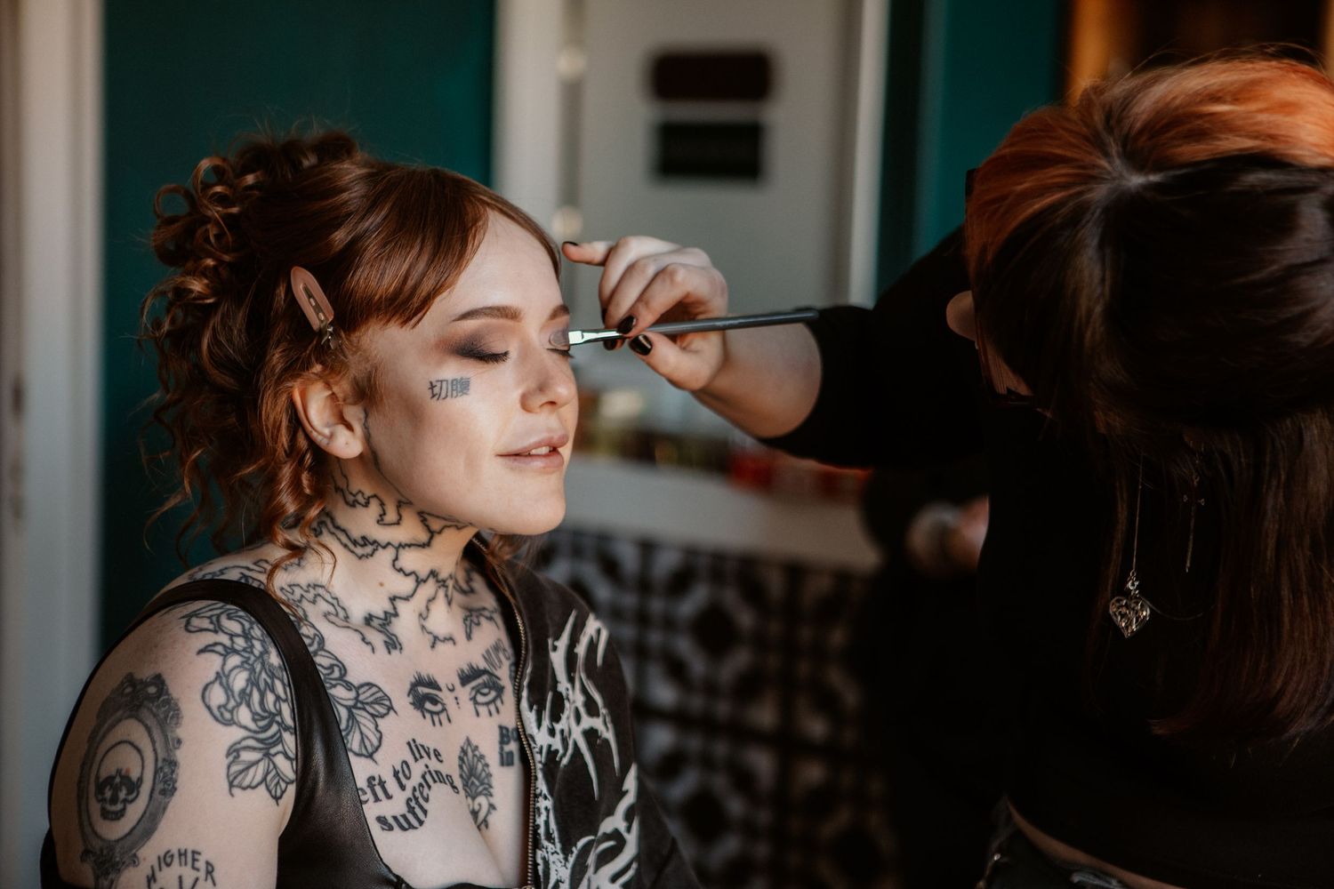
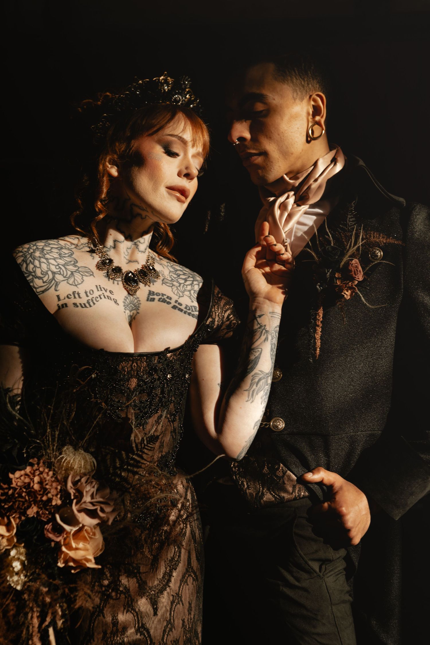
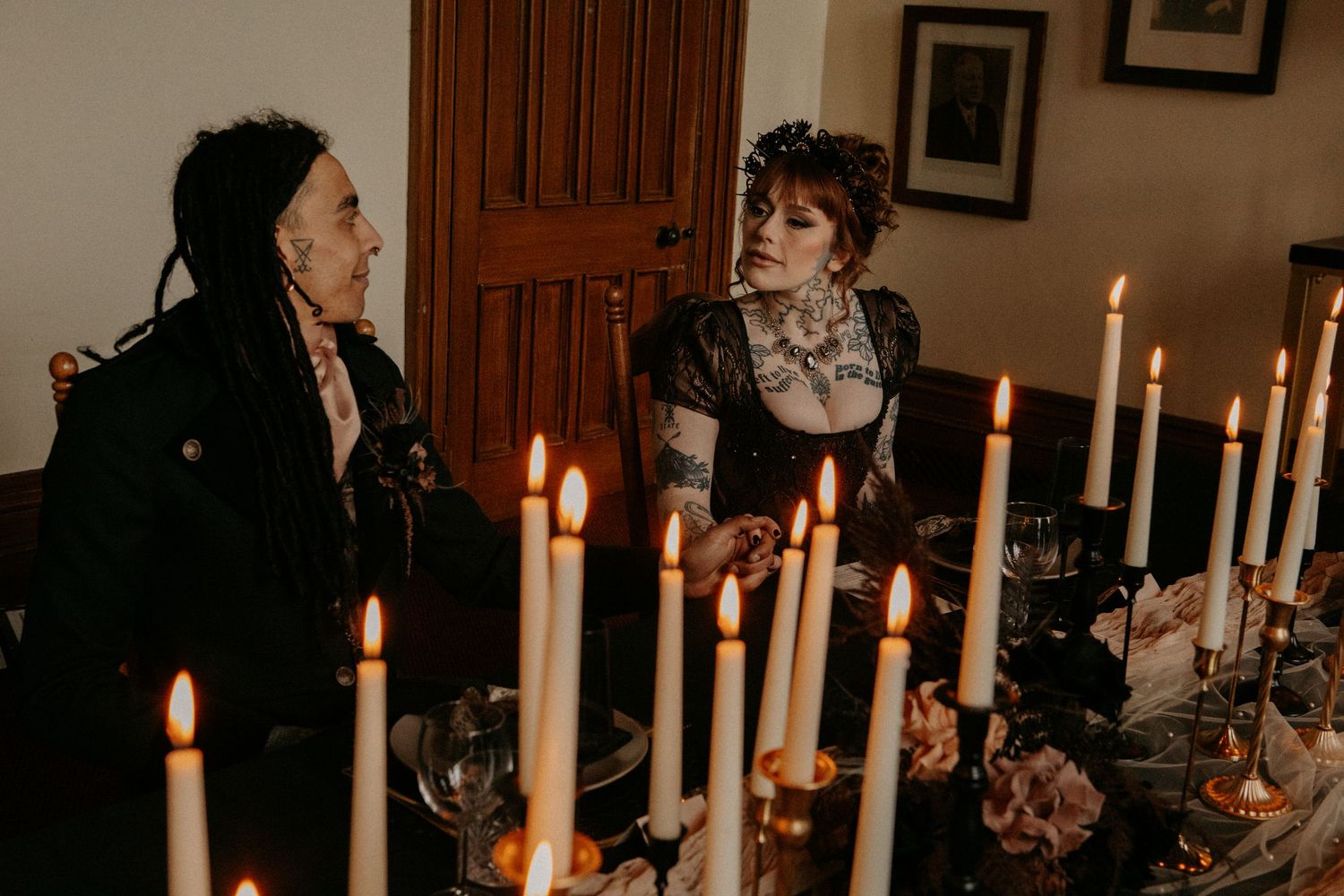
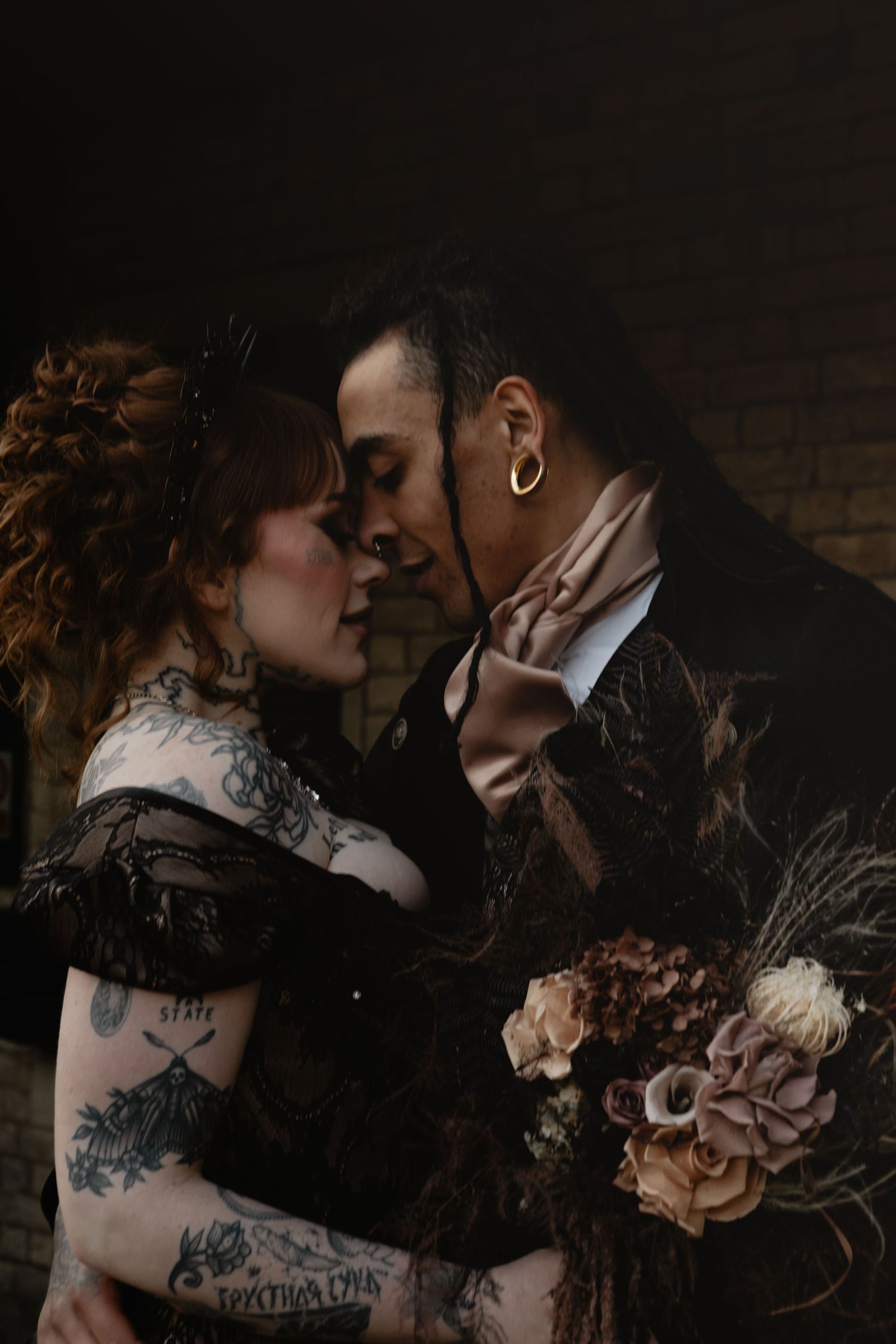
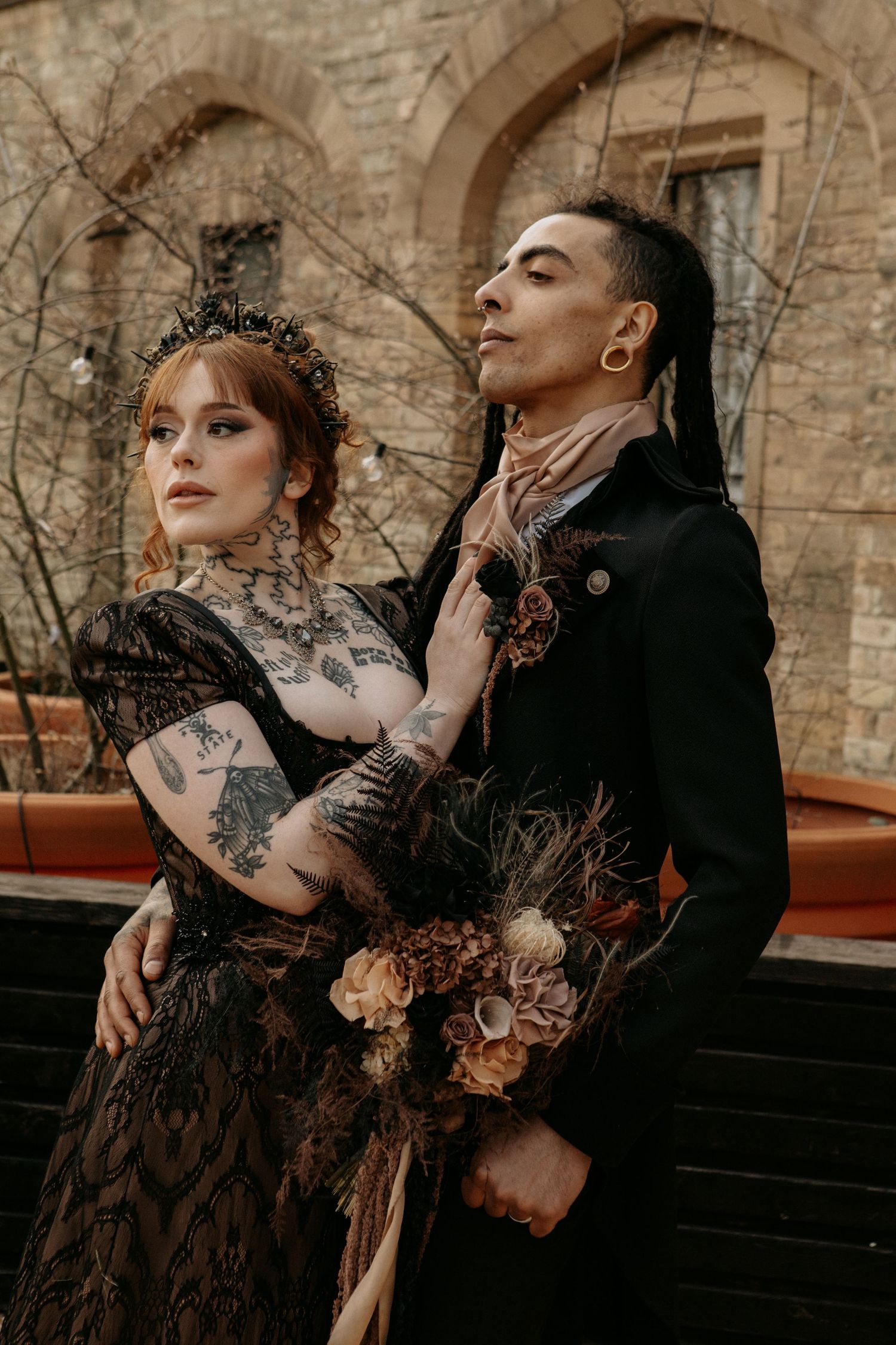
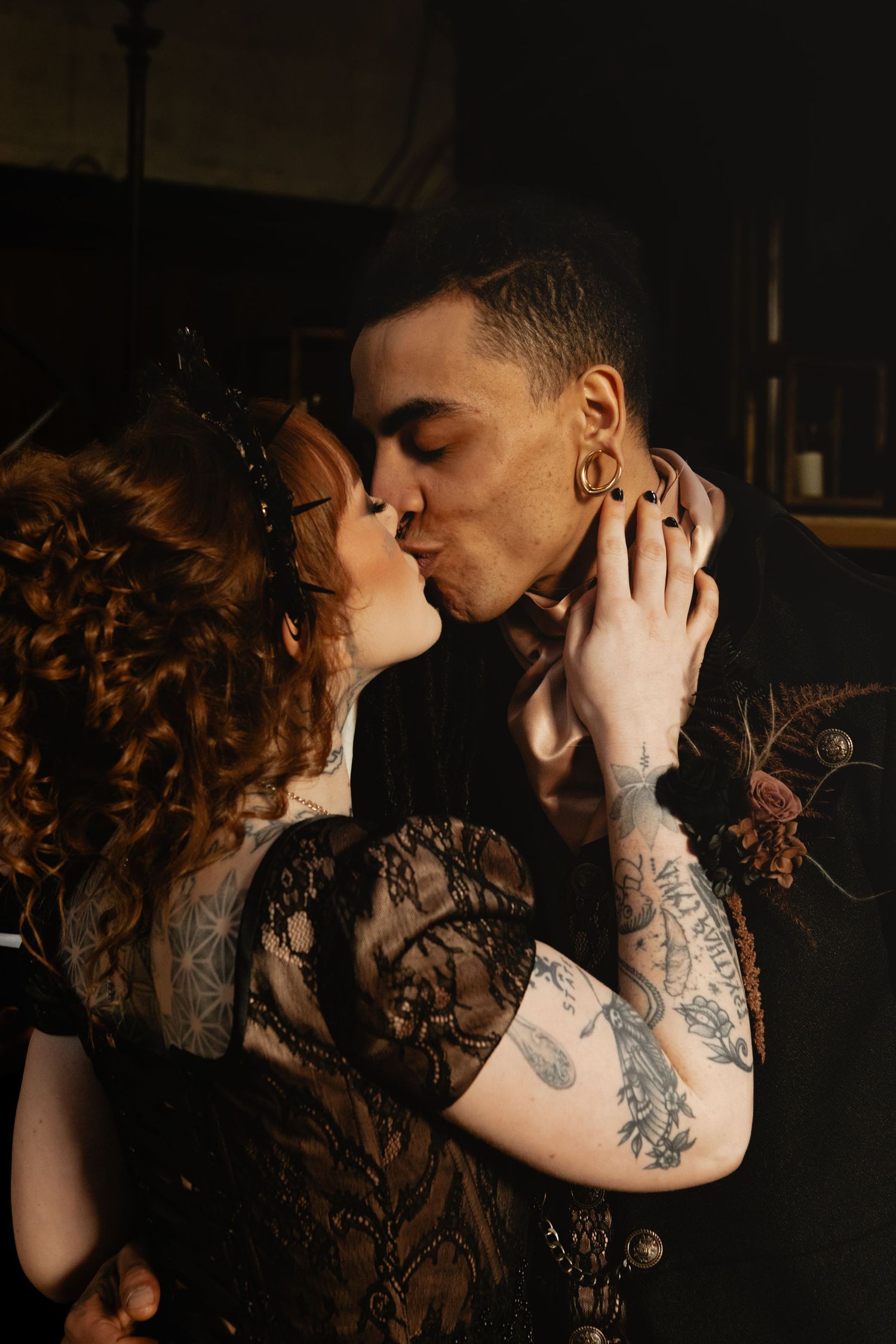
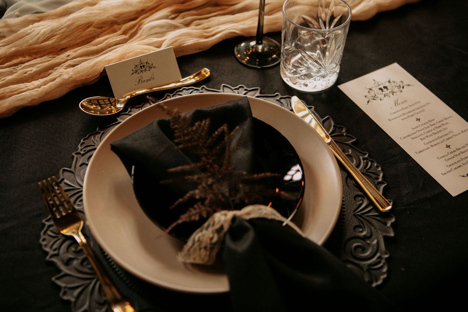
If you’re drawn to the romance and elegance of traditional wedding styling but want to give it a darker, more alternative edge, a palette of warm browns, rich golds, muted neutrals and black can create something that feels beautifully romantic without becoming overly soft or traditional.
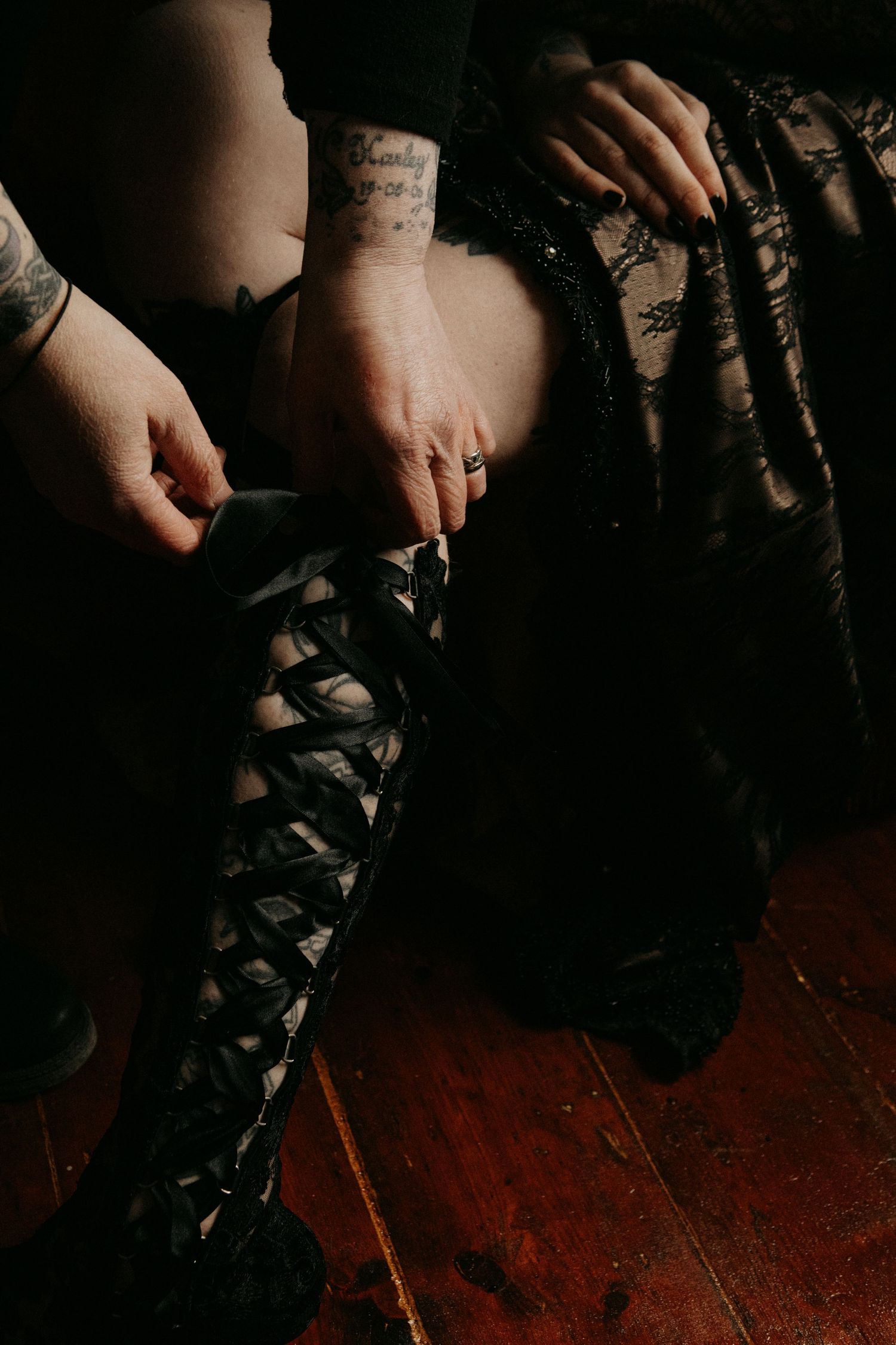
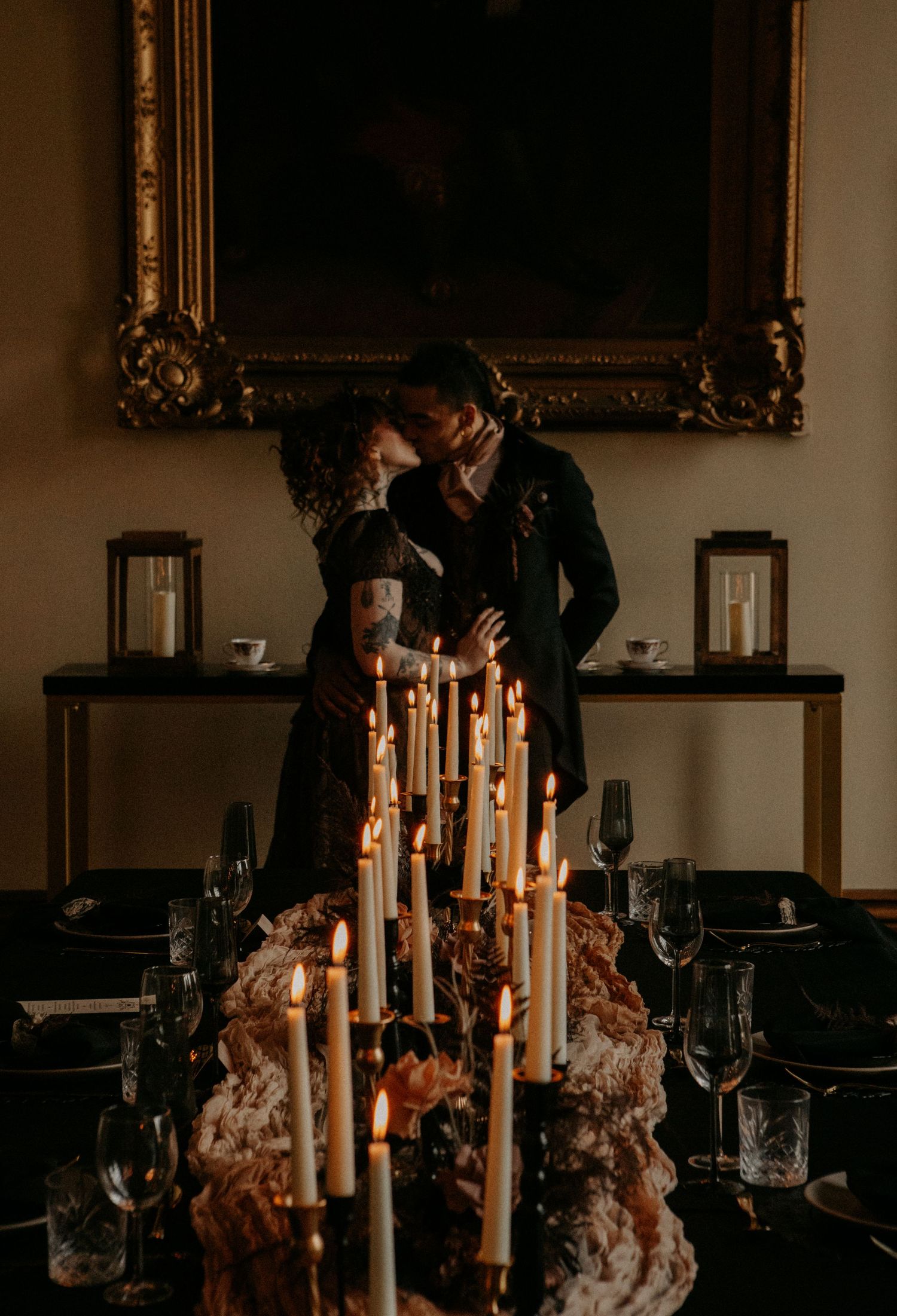
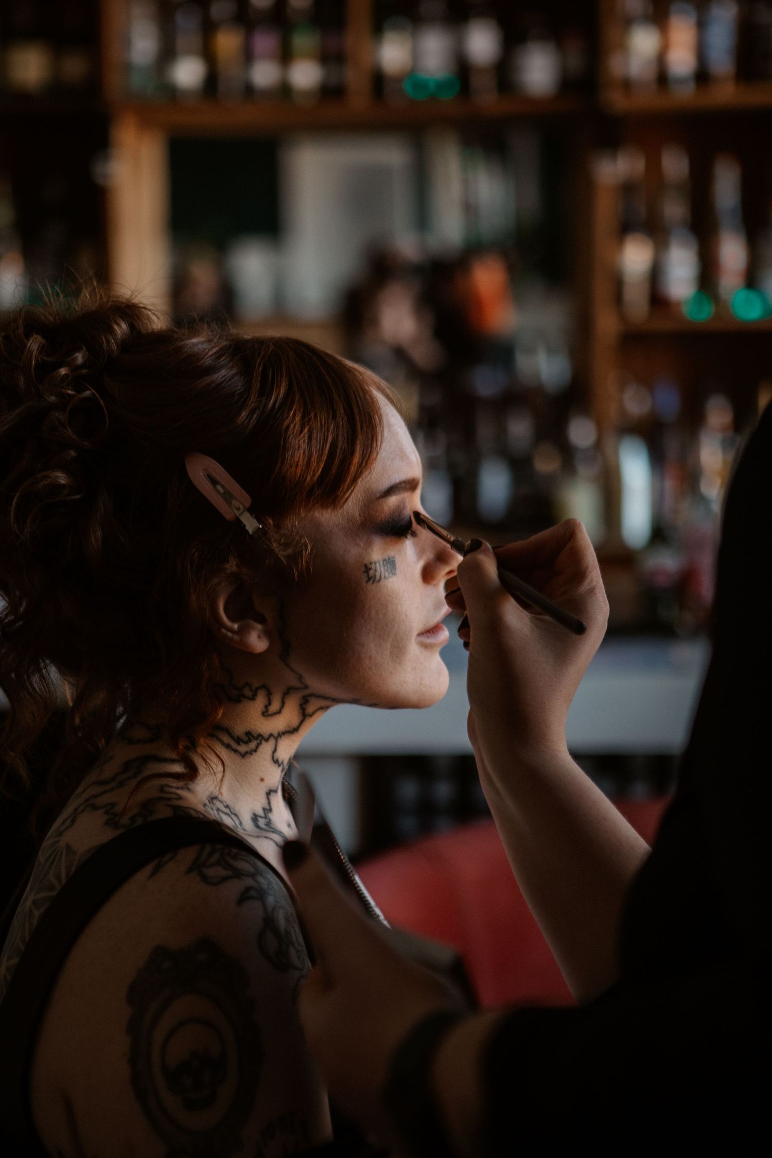
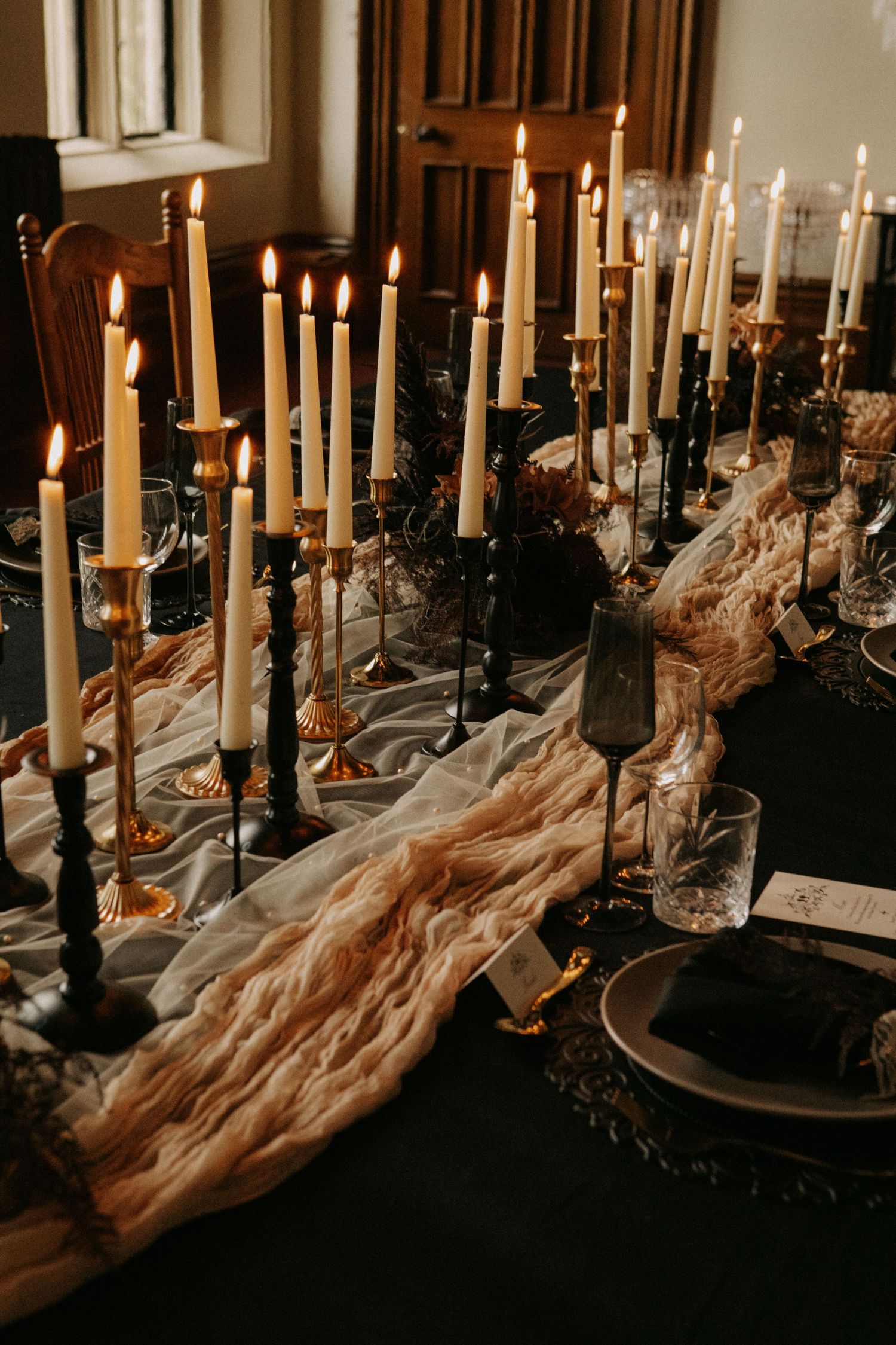
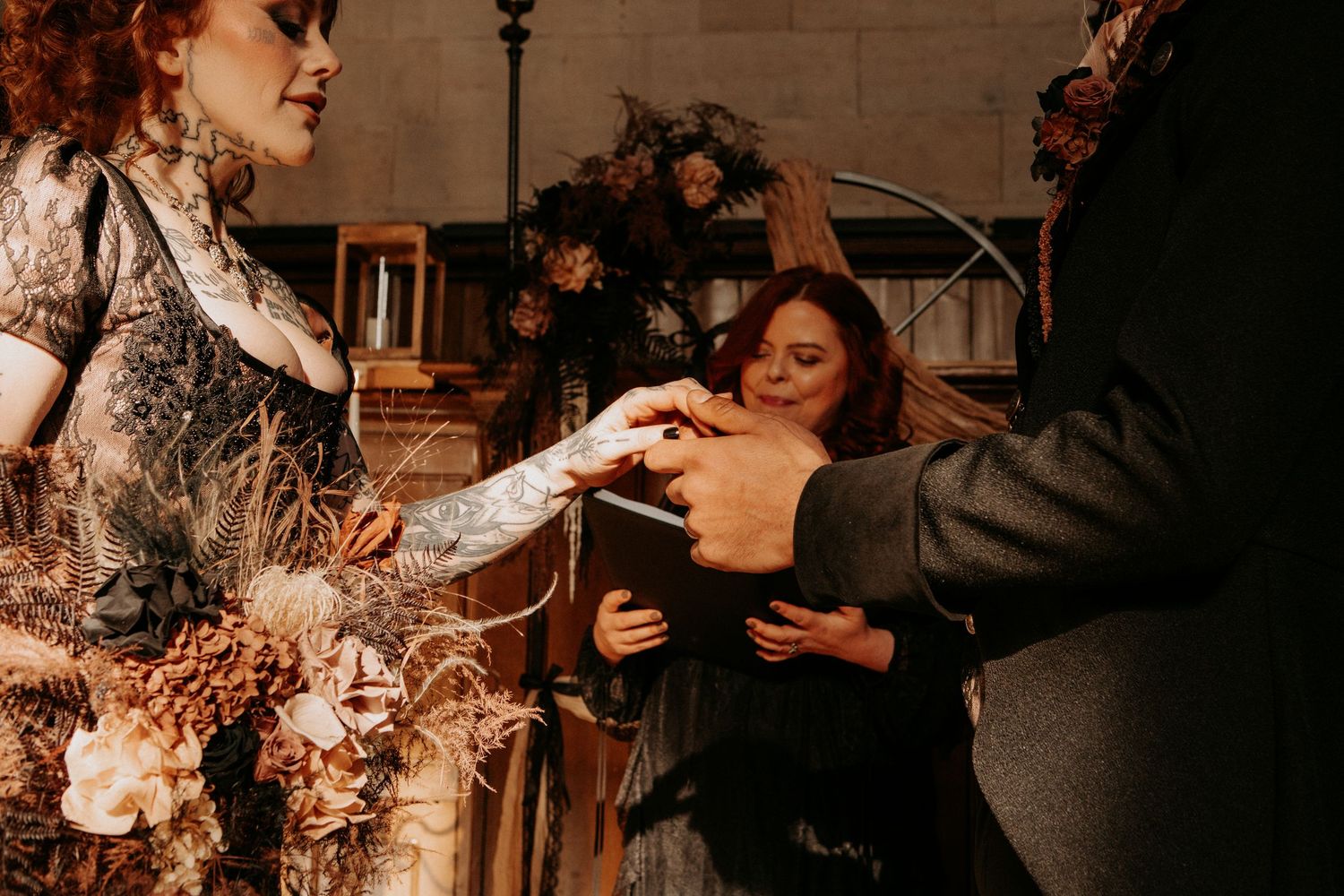
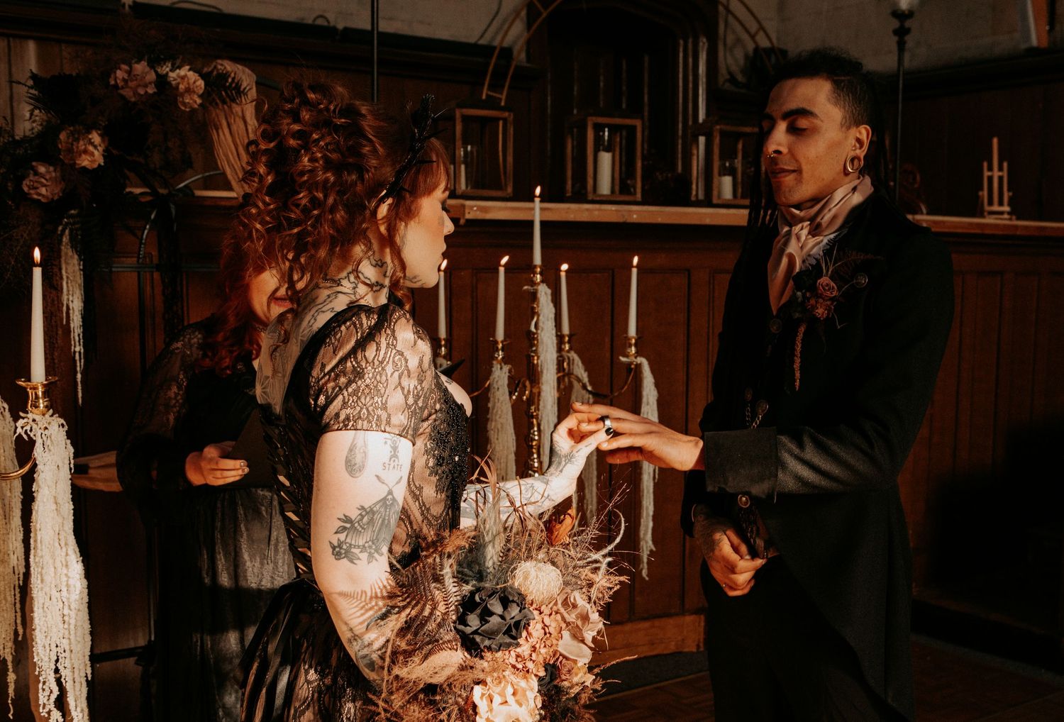
Think deep chocolate and espresso tones alongside warm taupe, antique gold, bronze, ivory and touches of black, layering those colours together to create a palette that feels rich and atmospheric while still having a softness to it. This was the colour inspiration behind my Emo Bridgerton editorial, where we took the romance and extravagance associated with the Regency era and dragged it slightly further towards the dark side.
What I love about this kind of palette is how much of the atmosphere comes from texture rather than relying on lots of different colours. Aged gold frames, dark wood, antique furniture, warm candlelight, delicate fabrics and dried or muted florals can all bring different tones and depth into the space while still feeling as though they belong together.
It’s also a perfect example of how an alternative wedding doesn’t necessarily need bold colours or obvious gothic details to feel different. Sometimes it’s the contrast between old-world romance and darker, more unexpected elements that creates something far more interesting, allowing you to take inspiration from traditional elegance without feeling as though you need to follow all of the traditions that come with it.
The result is something warm, decadent and a little dramatic, almost as though a beautifully extravagant Regency romance discovered emo music and decided it quite liked it there.
So, What Does A Gothic Wedding Actually Look Like?
The answer is whatever the hell you want it to.
Hopefully, if these four colour palettes have shown you anything, it’s that planning a gothic or alternative wedding doesn’t mean you’re limited to black, red and the occasional skull thrown in for good measure. It can mean rich jewel tones and candlelight, bright pinks and oranges, chaotic Beetlejuice-inspired stripes or warm, antique colours that feel as though they belong inside a slightly darker version of a period drama.
The best colour palette for your wedding isn’t necessarily the one that looks the most gothic or the one currently taking over your Pinterest feed. It’s the one that helps create the atmosphere you want your wedding to have and feels like a genuine reflection of the two of you.
Take inspiration from the things you already love, whether that’s the films you watch, the clothes you wear, the way you decorate your home or the places you naturally feel drawn towards, and use those things as the starting point for creating something of your own.
And if none of these four palettes quite feel like you, don’t worry, because I’m nowhere near finished yet.
Part Two is coming with even more gothic and alternative wedding colour inspiration that goes far beyond black and red.